


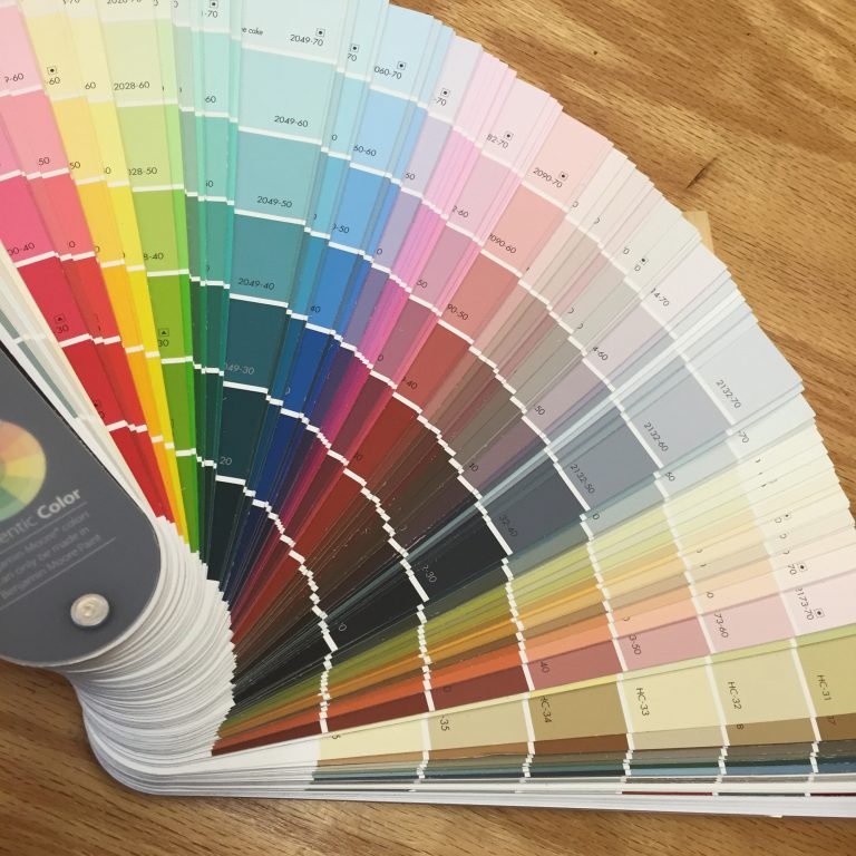
Picking the right paint color for each room of your home can be a daunting task. The color you select can drastically change a space’s atmosphere, mood, and functionality. Here’s a guide to help you choose the best paint colors for different rooms of your house based on their purpose and the ambiance you want to create.
Living Room: Warm and Inviting Tones
The living room is often the heart of the home—a place to relax, entertain, and spend time with loved ones. For a welcoming and comfortable atmosphere, opt for warm, neutral tones such as beige, light gray, or soft taupe. These colors create a calming environment and work well with a variety of furniture styles. If you want to add a touch of energy, consider incorporating accent walls with deeper shades like navy blue, charcoal, or rich greens. These bold hues can create contrast and make the room feel cozy without overwhelming it. Once you have chosen a color for your rooms, you’ll want the most professional finish you can get. This is why it’s recommended to hire an expert painter London UK that has the right skills and experience to do a good job.
Kitchen: Bright and Energizing Shades
The kitchen is typically the busiest area of the home, where people cook, gather, and sometimes even socialize. To promote a vibrant and energetic vibe, choose colors that stimulate appetite and creativity. Soft yellows, buttery creams, or mint greens are excellent choices for a fresh and uplifting kitchen. These colors evoke warmth and happiness, making the space feel open and inviting. For a more modern and sleek look, you might want to consider shades of white, off-white, or even cool grays. These neutral colors create a clean, crisp environment, which is ideal for food preparation.
Bedroom: Calm and Relaxing Hues
Your bedroom is a sanctuary—a place to unwind and recharge after a long day. Therefore, the color of the walls should promote relaxation and restful sleep. Soft blues, lavenders, or muted greens are ideal choices for a serene, calming ambiance. These cool tones are known for their soothing qualities and can help reduce stress and anxiety. If you prefer a warmer color palette, soft neutrals like taupe or warm greys can provide a cozy and peaceful feel. Avoid using overly bright or stimulating colors, as they can interfere with sleep.
Bathroom: Fresh and Clean
Bathrooms are spaces where you get ready for the day or wind down at night, so choosing the right color is crucial to creating a fresh, clean, and refreshing atmosphere. Light blues, soft greens, or even pale aqua are great options for creating a spa-like feel in the bathroom. These cool tones evoke a sense of cleanliness and tranquility. White or off-white is another classic choice, as it makes the space feel bright and airy, especially in smaller bathrooms. If you want to add a touch of elegance, muted grays or soft taupes can give the bathroom a sophisticated vibe without making it feel cramped.
Home Office: Productive and Focused
A home office needs to inspire productivity and focus, so your choice of color should be energizing but not distracting. Light blues and greens are perfect for promoting concentration and reducing stress. They create a calm environment while still maintaining a level of energy that encourages productivity. If you prefer a more neutral palette, soft grays or beige can also be effective, offering a professional and clean look. Avoid overly bright or bold colors, like red or bright yellow, as they may cause overstimulation and disrupt concentration.
Dining Room: Warm and Welcoming
The dining room is a place for meals, conversation, and socializing. Warm, rich colors like deep reds, burnt oranges, and mustard yellows can stimulate appetite and create a cozy, intimate atmosphere. These shades also encourage conversation, making them ideal for spaces where people gather around a table to share a meal. If you prefer a more understated look, earth tones like terracotta or muted browns can provide a rustic, welcoming feel.